Aligning Teams Around a Unified Vision
A company-wide event needed a clear and cohesive identity—one that could bring alignment across teams while supporting a wide range of content and outputs.
Event Identity · Brand System · Environmental Design · Keynote Production · Merchandise · Retail Environment
Creative direction lead — concept through execution across all touchpoints, environments, and teams
A complete identity system spanning four floors of the Seattle Convention Center — from keynote stage to swag store, window clings to merchandise
GKO is Confluent's annual global growth kickoff — a high-energy event that brings sales and marketing together around a shared theme and direction. For this edition, GKO was moving to Seattle for the first time, leaving behind Las Vegas where it had been held in previous years. That shift created a real creative problem. Las Vegas carries its own energy — the spectacle, the scale, the sense of occasion. Seattle didn't come with any of that built in. We had a genuinely beautiful venue in the Seattle Convention Center, but a stunning space doesn't automatically feel exciting to a sales team that associates GKO with Vegas. The identity needed to do two things at once: replace the energy people expected, and make Seattle feel like an intentional, inspired choice rather than a step down. The theme — Always Onward — gave us the creative foundation to do that.
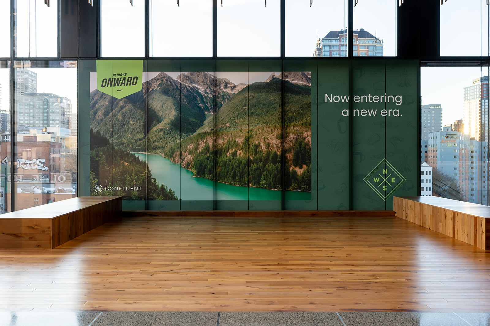

The answer was to lean into the Pacific Northwest — not as a decorative gesture, but as a genuine creative direction. The region's landscape became the visual world of the event: misty forests, mountain ridges, raw rock textures, towering conifers. Always Onward wasn't just a theme; it was a feeling that the PNW environment made tangible.
The visual system was built in layers, each adding texture and depth to the identity:
Logo and badge system
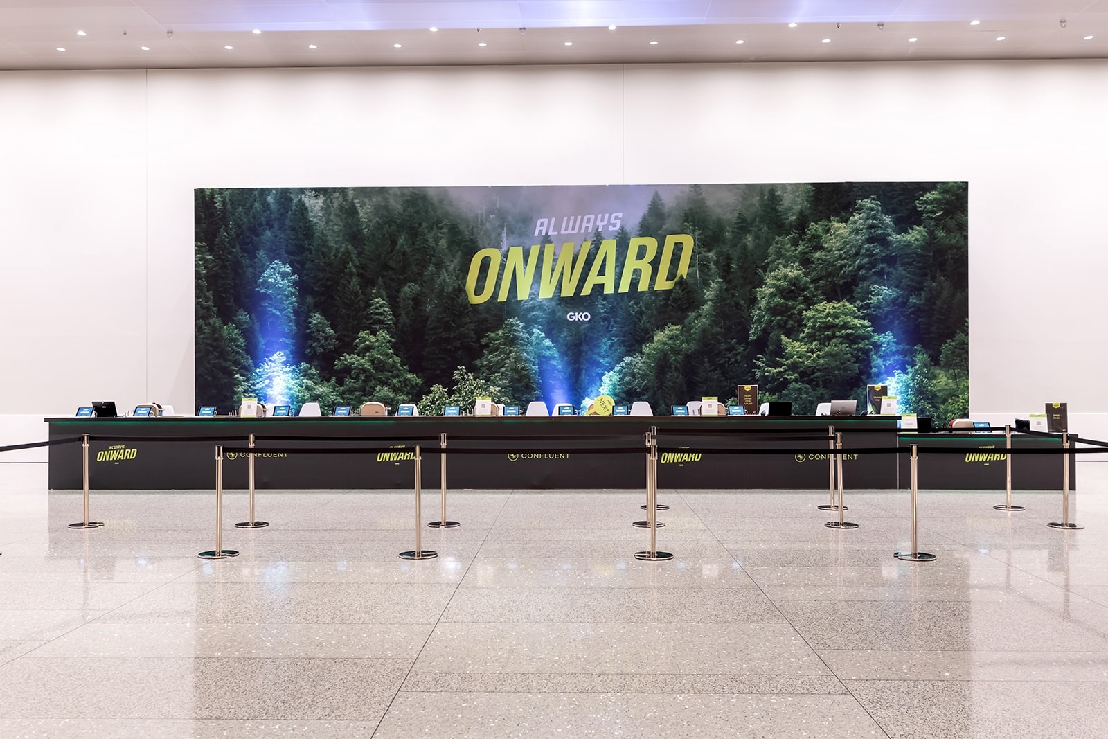
The Always Onward wordmark — bold, italicized, forward-leaning — was packaged into badge and ribbon lockups that scaled from keynote screens to badge lanyards to merchandise tags.
Color
A deep forest green palette — anchored by two rich greens and an electric lime — gave the identity a sense of the outdoors without feeling literal. The lime provided the energy and contrast that kept everything from feeling too serious.
Topographic map pattern
A topographic line pattern — flexible enough to cover full backgrounds or sit as a subtle corner texture — became the system's primary graphic element, referencing trail maps and elevation charts to reinforce the idea of forging a path forward.
Photo textures
PNW photography — foggy forests, slate rock faces, moss-covered bark, mountain ridgelines — was layered over color fields, giving the system warmth and authenticity that flat design alone couldn't achieve.
Hand-drawn object icons
A custom icon set of outdoor objects — compasses, carabiners, camp mugs, axes, tents — added personality and kept the identity feeling hand-crafted rather than corporate.


The identity was deployed across four floors of the Seattle Convention Center — a vertical space connected by escalators, where each landing became an opportunity to reinforce the theme.
I concepted and built the complete style guide from scratch — color system, topographic patterns, photo textures, hand-drawn icon set, logo lockups, typography, and layout guidelines — giving every team and vendor a single source of truth to execute from.
Four sets of window clings, one per floor, used full-scale PNW mountain and forest photography against the convention center's floor-to-ceiling glass. The Seattle skyline visible through the windows became part of the design — the city framed by wilderness.
I designed the full keynote LED wall content — a sweeping forest backdrop for the main sessions, shifting to a deep galaxy sky for the President's Club Awards. At that scale, on a curved screen, the visuals felt cinematic rather than presented.
The swag store was designed as a full retail environment — branded grid-wall merchandising, custom signage, and a curated product range I designed from scratch: sweatshirts, backpacks, beanies, water bottles, socks, and puffer jackets.
Throughout the Growth Hub and hallways, environmental signage, customer quote boards, and wayfinding totems carried the identity consistently across every space.


The result was a cohesive identity system that brought alignment across teams and improved the overall clarity of the event experience.
The framework enabled more consistent execution across materials and environments, while allowing teams to work more efficiently and with greater confidence.
More importantly, it shifted the process from individual interpretation to shared understanding—creating a stronger, more unified outcome across the organization.